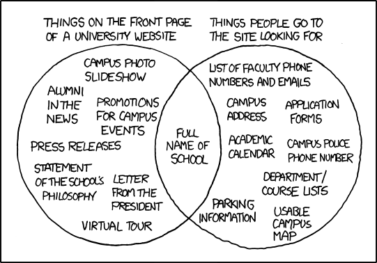
It also reminds me of the kinds of things clients have wanted on their opening pages for elearning projects: statements of purpose, information about the genesis of the project, almost-vacuous statements about what this elearning project will do for you. The latter I really doubt as being useful since people will end up on the page because they've been told to, or because they know what advantage it will provide.
At the same time that I take the point the illustration is making, that there's a kind of generic expectation of websites that their first pages will be filled with this kind of fluff. And it makes a certain kind of sense, just like the acknowledgments page is often the first one in a book, but of limited interest to many readers (or the copyright page for that matter).
Besides, how would one fit all of those things in the right-hand circle that people are looking for on to one page? The difference between the right-hand circle and the left, is that the left is written for a generic kind of reader - an ideal one - who doesn't really exist (or if they do, it's only a few individuals who are looking for this information). Actually, as a job seeker, those statements of purpose can be very handy for getting a grip on what the university thinks of itself and what kind of teaching will take place there, so perhaps the information in the left-hand circle really is more useful than the illustration implies.
But the problem with making the information on the right-hand circle the primary page is that it addresses at least three different audiences: staff and faculty of the school, students at the school, and outside parties interested in attending/visiting the school. That's a lot of audiences for one page to address and address effectively.
The way webpages are conventionally set up, there's a large space near the middle, intended to address the audience interested in the page. But when you've got several audiences, which one would you privilege? This is why those primary pages often include navigation that separates users into functions, i.e. "for students" "for alumni" "for faculty" etc. in order to then address that audience and only that audience in that next level of webpage.
So I take the point of the illustration that much of what's on the left-hand side of it is information few are interested in. But given the number of different users of a university website, it seems that such general pages are by default the best use of the first page.
No comments:
Post a Comment